RAGS LOGO AND BRANDING
Logo design, custom type design, and visual identity.
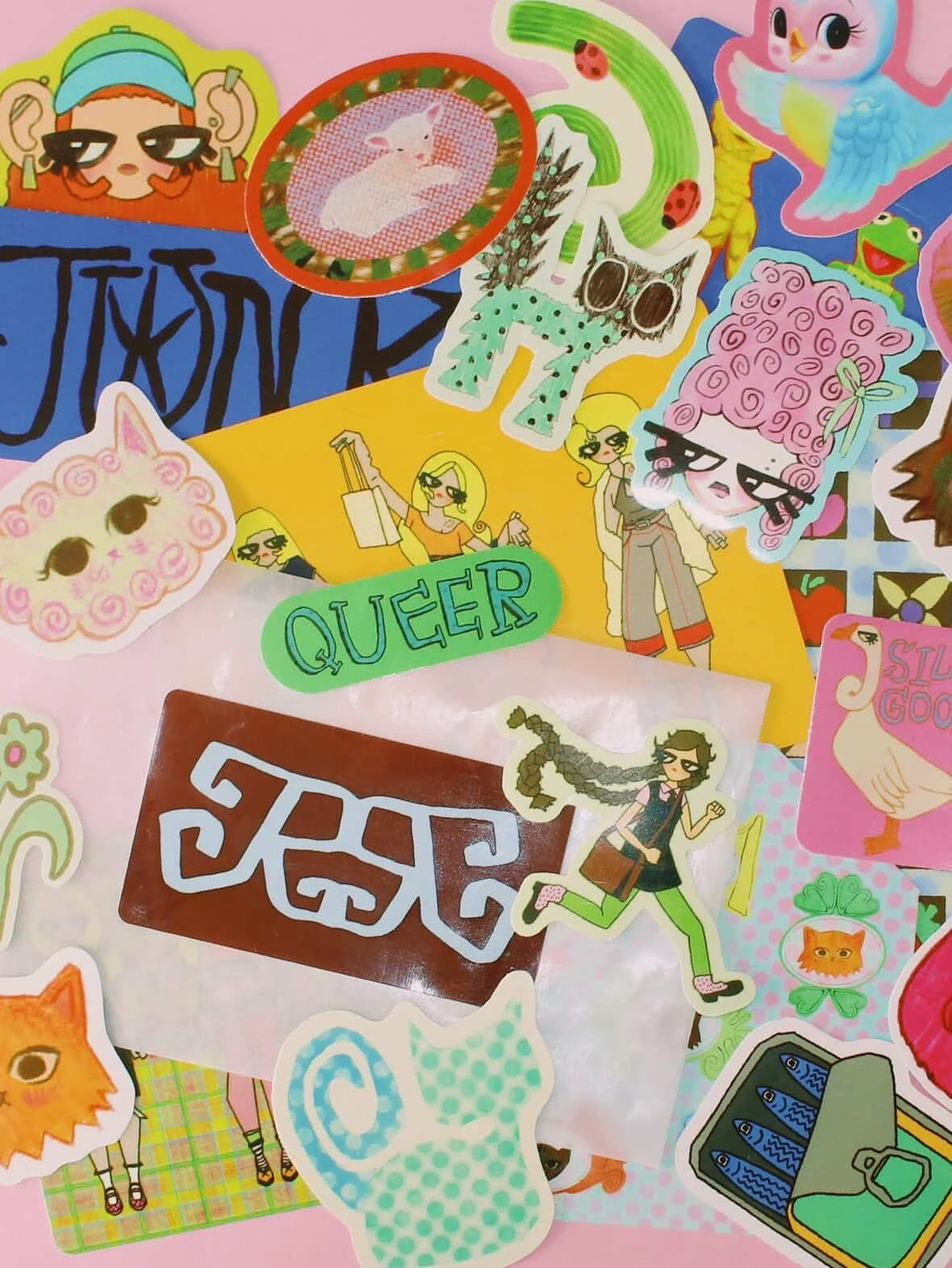
Rags is an independent artist whose work has evolved into a vibrant world of stationery and illustration. They were looking for a brand identity that felt more aligned with this new direction, something very playful and full of personality, while still maintaining a sense of structure and intentionality.
They approached me to create a logo and a lightweight brand system that could live across business cards, thank-you notes, and product packaging, rooted in expressive typography and thoughtful color.
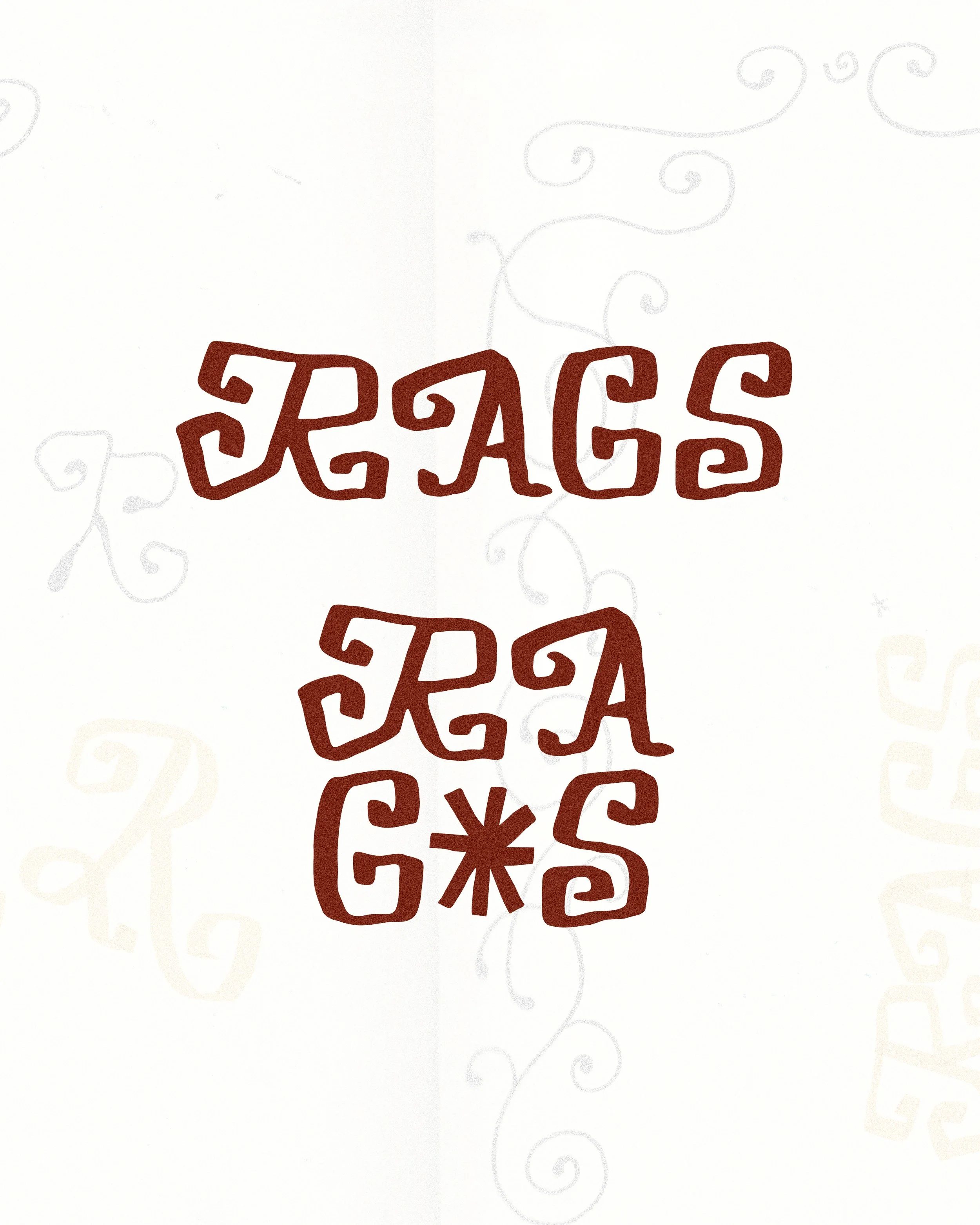
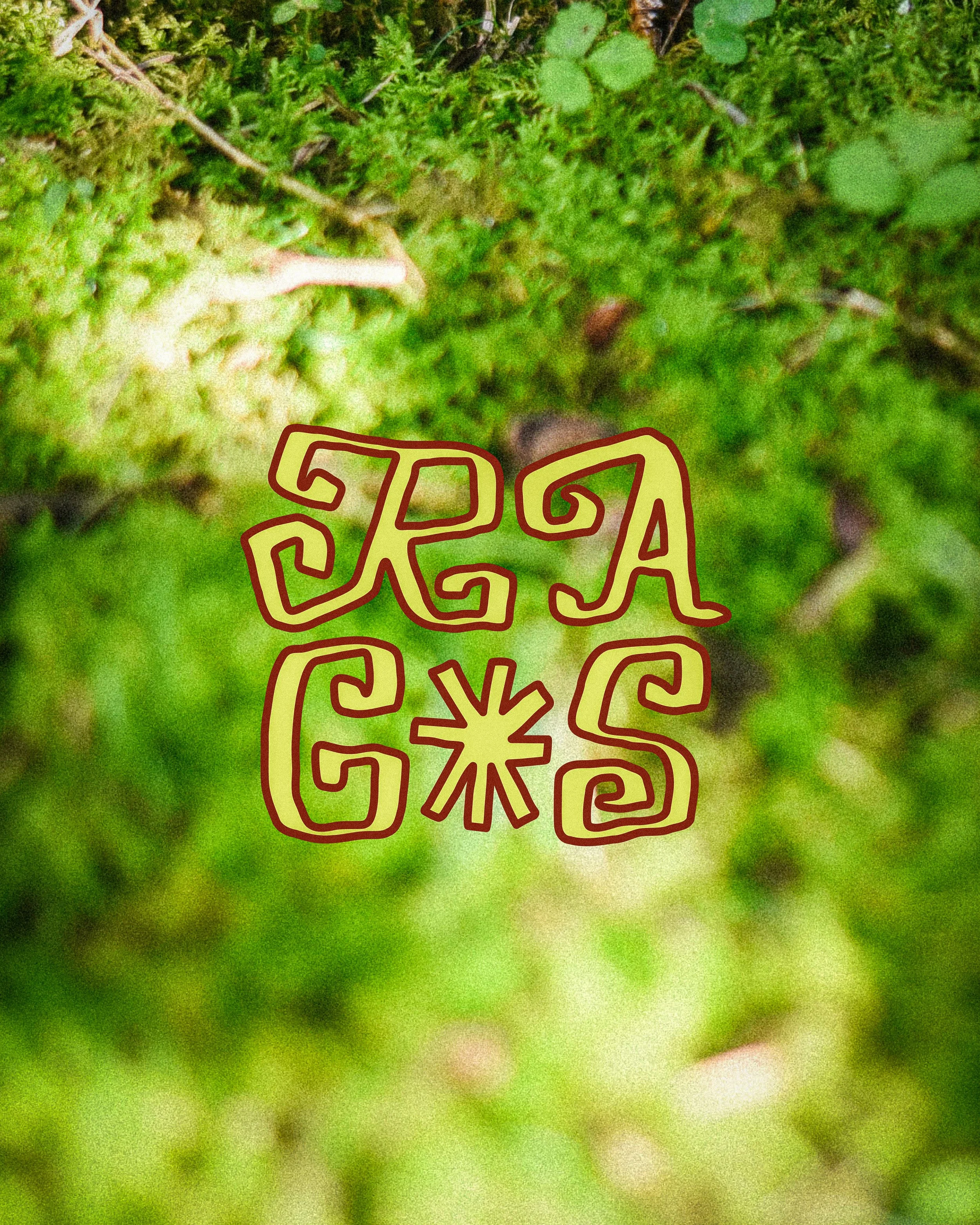
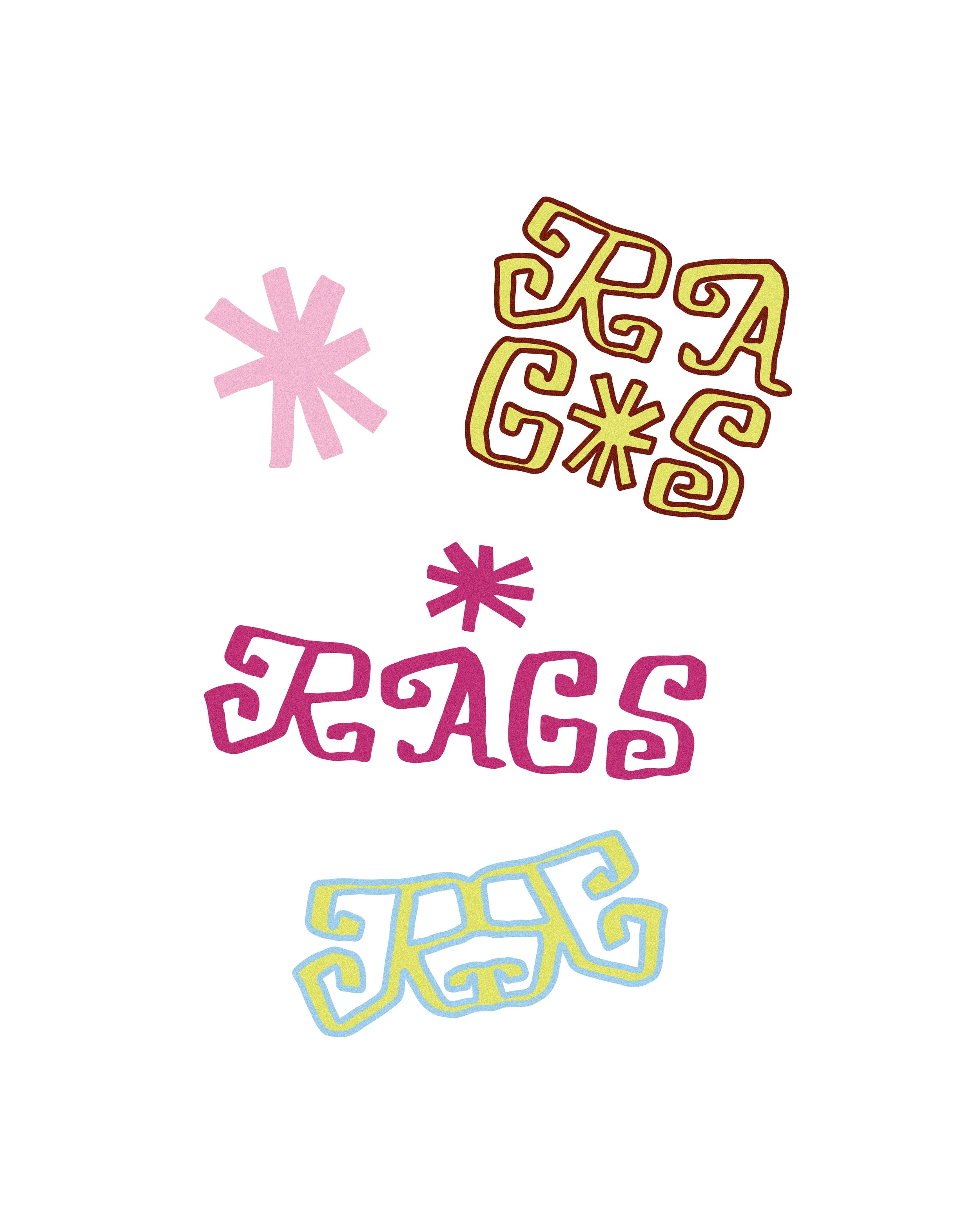
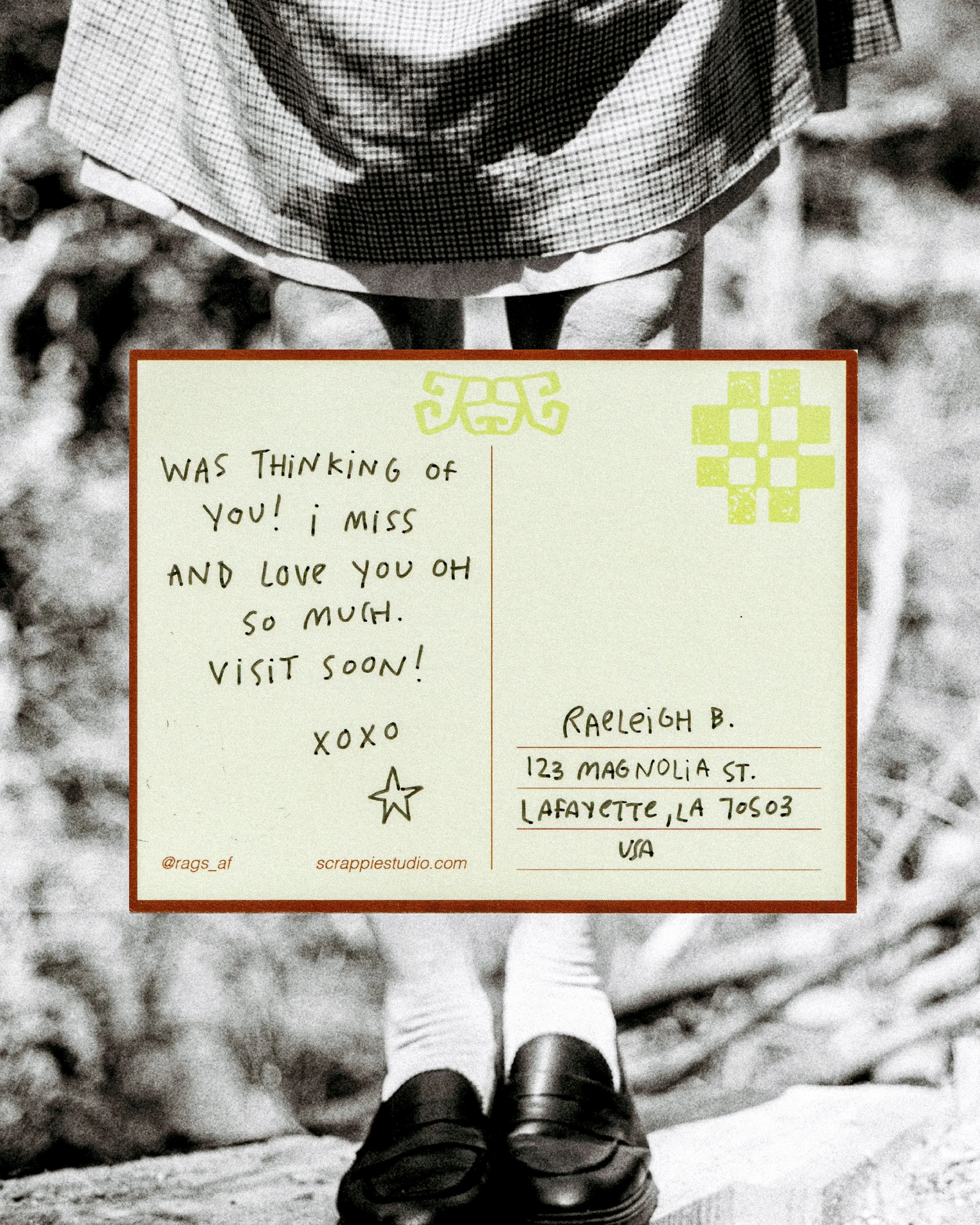
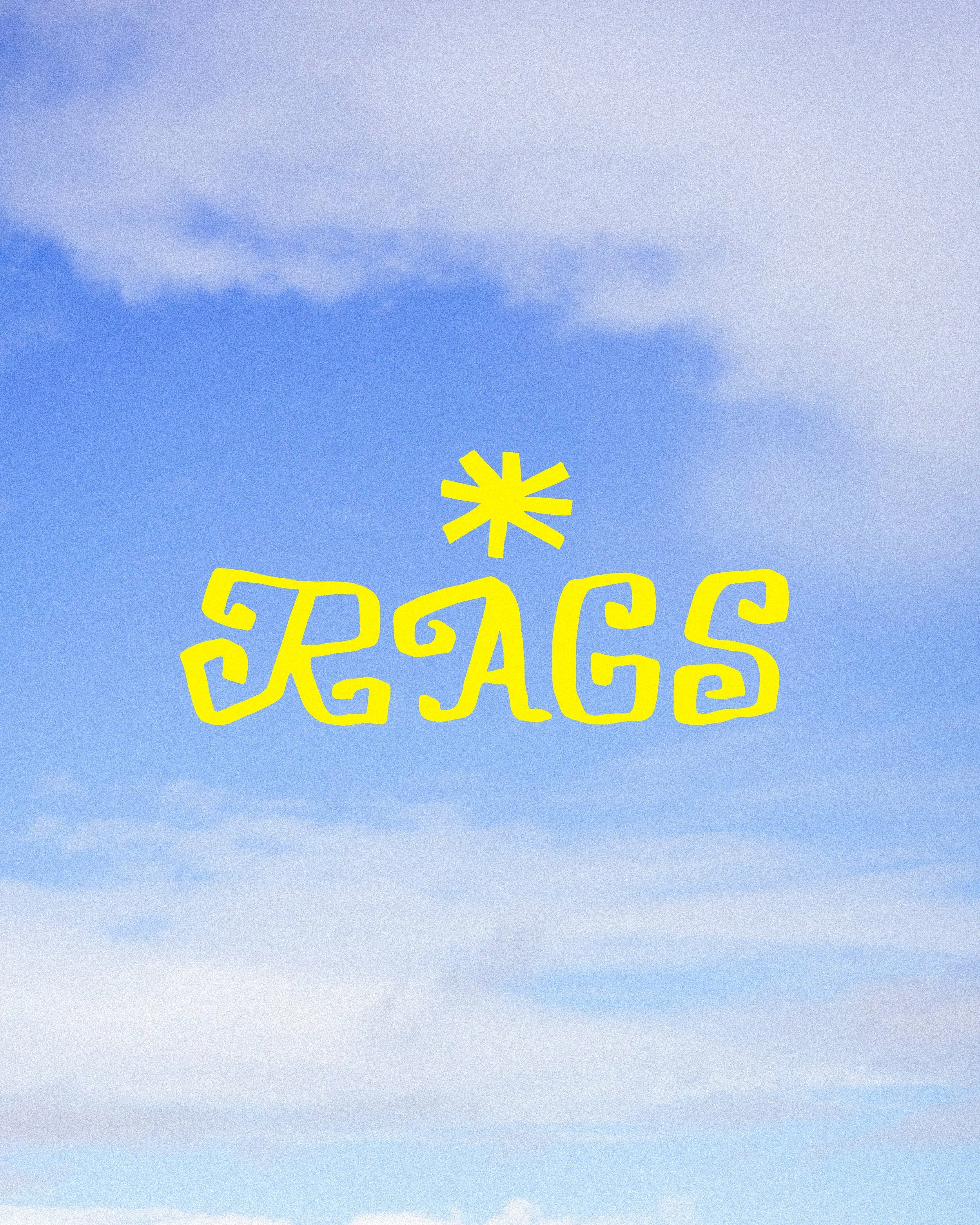
The final direction centers around a hand-drawn logotype created using a highlighter pen, embracing imperfect symmetry and bold, blocky forms that echo the energy of their illustration style.
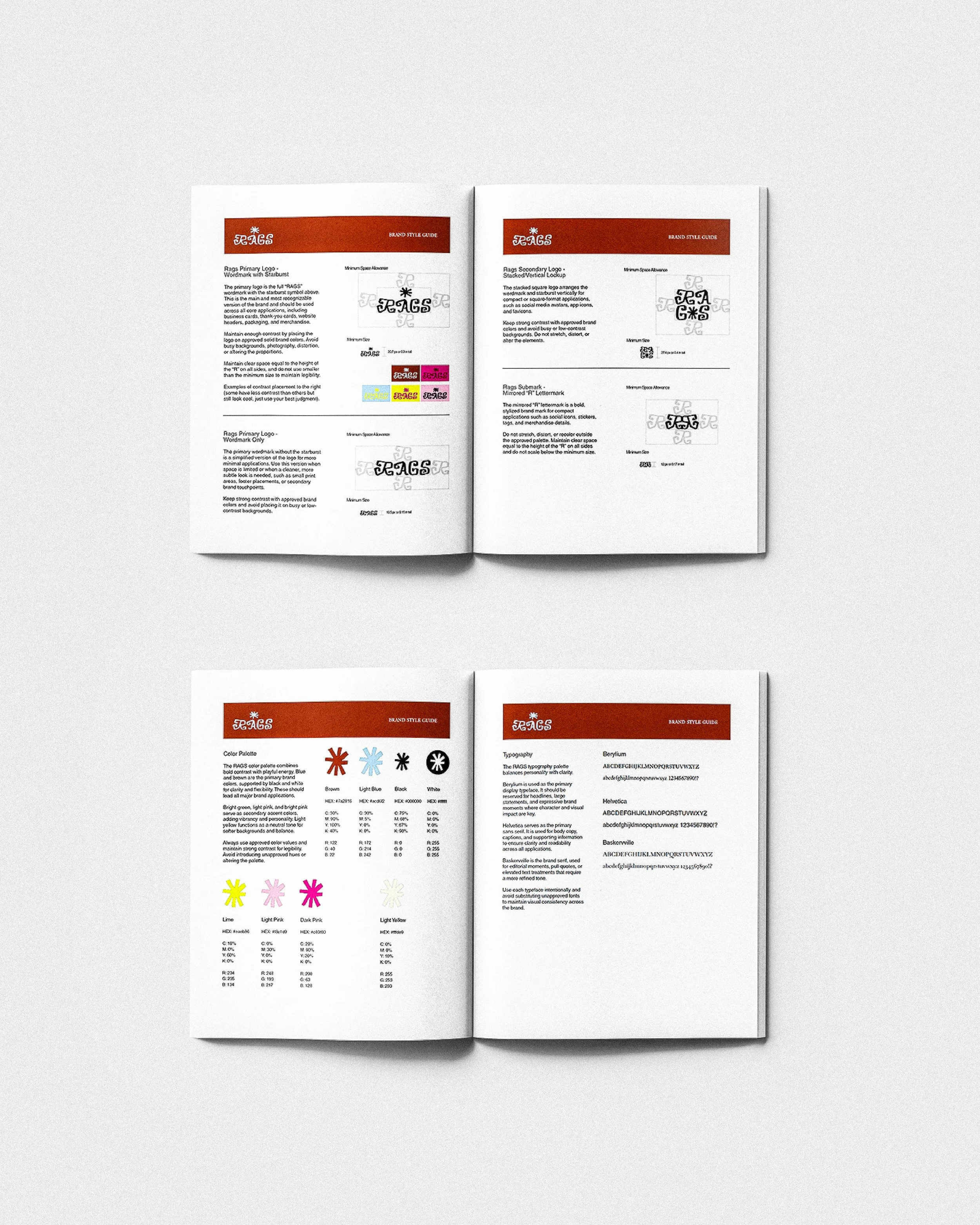
A mirrored “R” lettermark was developed as a secondary element, offering a striking, graphic shorthand for the brand. Paired with a complementary typeface selection and a cohesive color palette, providing structure to unify their materials, while leaving room for their work to shine.
Collaborating with Rags was such a fun process, sharing our love of playful visuals, experimentation, and craft.
View the Rags Style Guide here.
THE LOGO
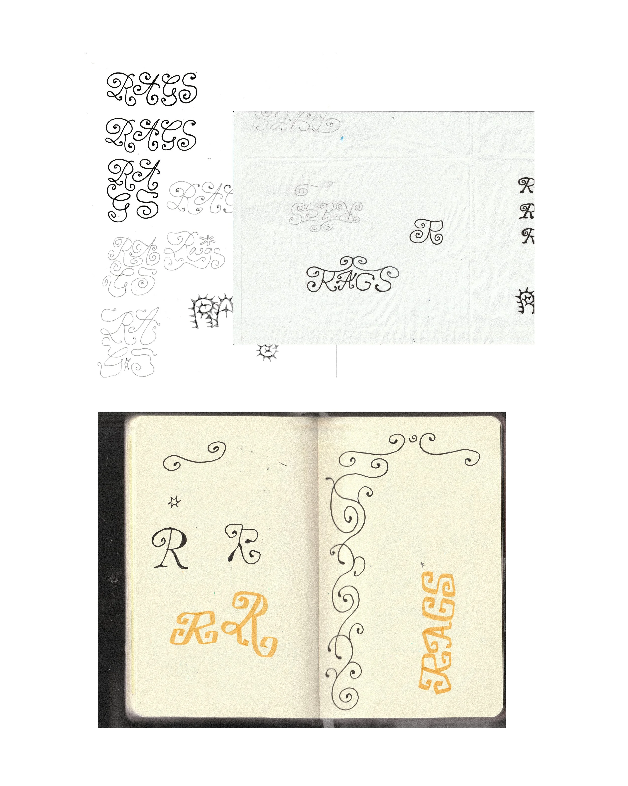
A big part of the logo development was translating Rags’s illustration style directly into letterforms. I experimented with drawing the type that resembled their work: full of shape, playful, and swirly.
I used analog materials like highlighter and marker to naturally build in texture and variation, then refined the drawings digitally. The goal was to keep that handmade, expressive quality while polishing it enough to function cleanly as a logo.